You lifted the hood.
Here’s the engine.
This site is a design system applied to itself: shared tokens, a small set of components, and pages generated by code from real project files. Same way I’d run it on a product team, at the scale of one.
parallax clamped to ±36px
ambient light: 2 blurred fields, 4% lerp to cursor
prefers-reduced-motion: all off
Started from the live Squarespace site: every case study, the archive and the about page, read and inventoried before anything was redrawn. Then each one rewritten around decisions instead of deliverables.
Built with Claude in Cowork, from Squarespace to this.
Streamlined flows · Healthcare · Accessibility · Forms
Overseas claims, without the paperwork.
Members abroad had to download a PDF, print it, sign it, scan it and upload it with their bills, and only found out what was required halfway through. We turned it into a guided, validated flow inside MyBlue.

- Role
- Lead Product Designer, via Optimity Advisors
- Client
- BCBS Federal Employee Program, 5M+ members
- Worked with
- Product managers, engineering, overseas members
- Scope
- Medical and pharmacy claims MVP, MyBlue web
More benefits, more calls.
FEP expanded its overseas benefits, and calls from overseas members to customer service climbed with them. The digital self-service program had one KPI that mattered here: reduce calls to the call center.
The claims process was a big driver. Medical and pharmacy claims ran on downloadable PDFs that had to be printed, signed, scanned and uploaded along with every bill. And members didn't see what was required until they were already in the middle of filing a claim.
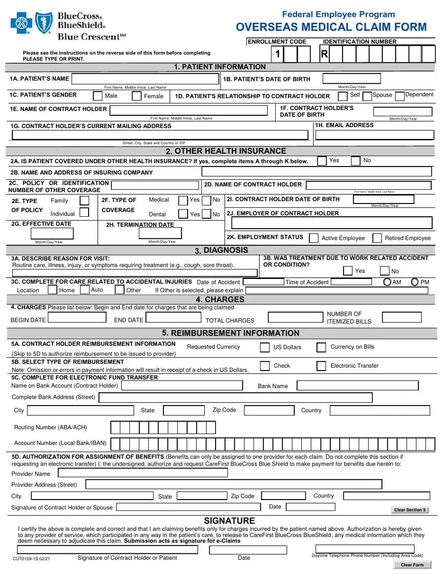
Enrollment code and member ID typed one character per box, with nothing to check them against.
→ Pulled from the member's account, never retyped.Name, date of birth, gender, relationship, contract holder: all already on file, all asked again on paper.
→ Seven fields prefilled in Step 1. Only the mailing address is editable.Other health insurance takes a fifth of the page, even for the majority of members who don't have any.
→ One checkbox. The fields appear only if it's checked.Reason for visit, work-related accident and accident details squeezed into one band with tiny checkboxes.
→ Step 2, with helper text in place and accident details shown only when relevant.Begin and end dates, total charges and number of bills typed here, with every itemized bill scanned and uploaded separately.
→ Step 3: structured fields plus drag-and-drop upload for up to 10 bills.Routing and IBAN one digit per box. Any omission or error and the member gets a paper check in US dollars.
→ Step 4: member or provider first, then only the fields for the payment type chosen.A wet signature on a printed PDF, then scanned and uploaded with every bill. What had to be attached was explained on page two.
→ An Agree and Authorize checkbox, a Submit button and a confirmation email.Three bets, one restructure.
With product managers and member usability sessions we scoped a first MVP around three hypotheses. Underneath them, the move was restructuring, not adding features: every section of the paper form mapped to a step, a prefill, a condition or an upload. Nothing the plan already knew gets asked twice, and nothing optional is shown until it's needed.
One question at a time.
Rough wireframes broke both claims into progressive, multi-step forms. Each one opens with what you'll need, then contact and claim type, then a distinct path per claim type. Required fields are flagged and warnings guide completion. The high-fidelity prototype used MyBlue design system components and became the test bed for usability sessions with overseas members.
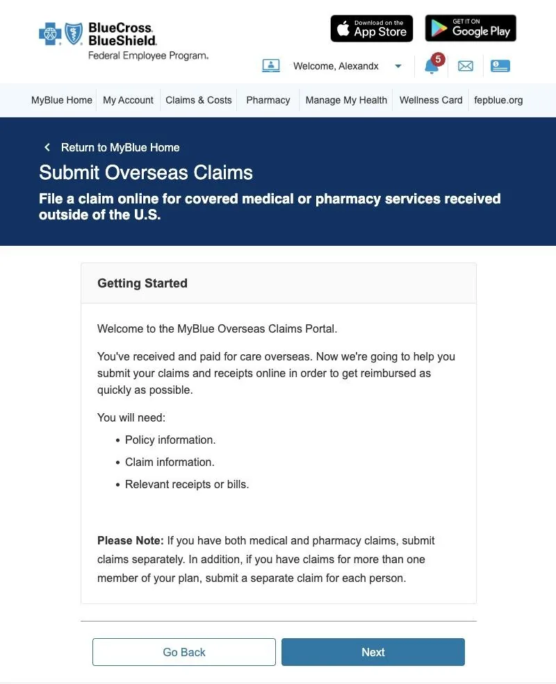
What members used to discover mid-claim is now the first thing they see: policy info, claim info and receipts. Nobody stalls halfway to go find a bill.
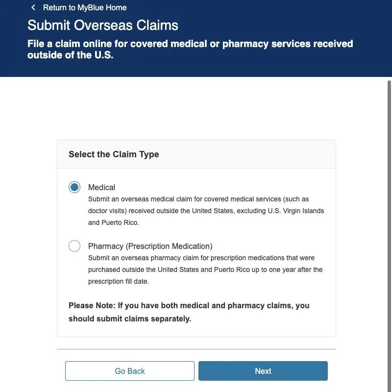
Medical and pharmacy used to be separate PDFs. Now they share an entry point; medical is the default and pharmacy branches to its own step.
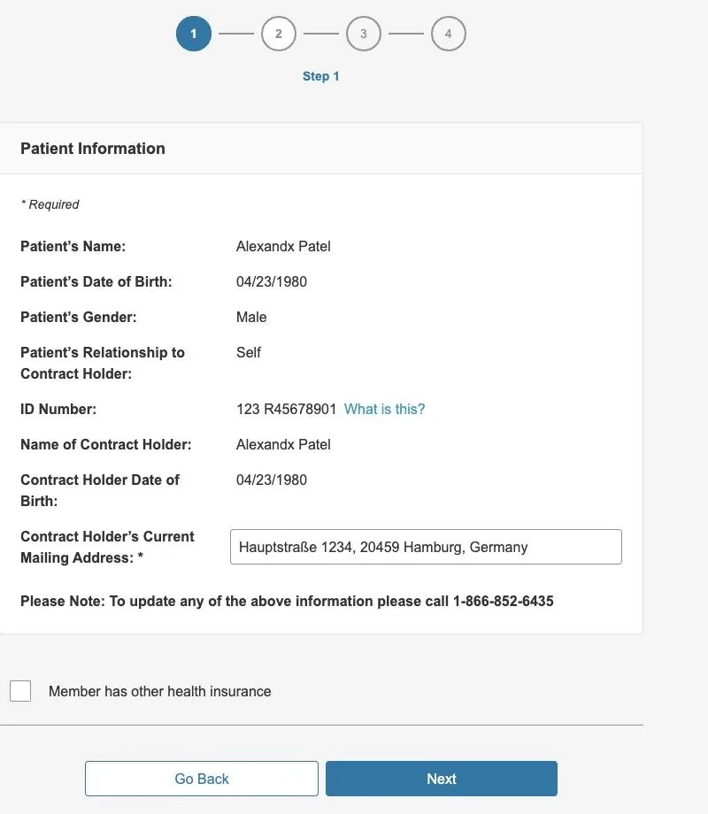
Everything the plan already knows is pulled from the account and shown read-only. The only editable field is the mailing address, and other insurance hides behind one checkbox.
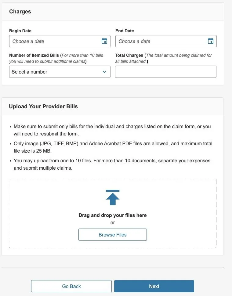
Dates, number of bills and total in structured fields, then drag-and-drop up to 10 bills. File types and size limits are stated before you upload, not after it fails.
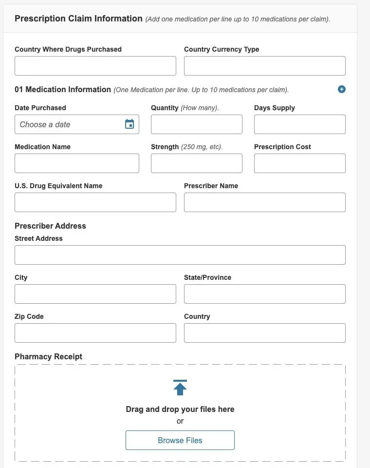
Each prescription gets its own row and its own receipt, up to 10 per claim, including the US drug equivalent so claims can be matched.
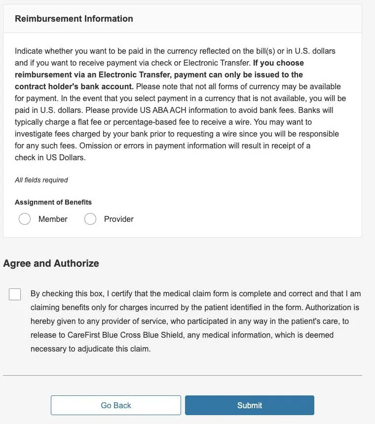
Member or provider comes first. Bank fields appear only for electronic transfer. The wet signature becomes an Agree and Authorize checkbox.
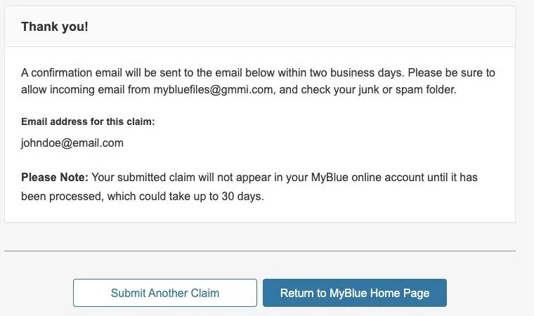
A confirmation email within two business days, and an honest note that the claim takes up to 30 days to appear. No guessing whether the upload went through.
Catch it now, not after review.
On paper, a missing field or signature only showed up after the claim was reviewed, or as a check in the wrong currency. In the flow, validation happens before you can move on, and it's designed to be read by everyone, including screen reader users.
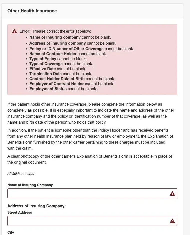
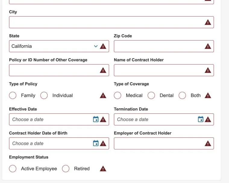
The prototype also covered terminated-member variants of both flows, entry points from across MyBlue, and responsive specs for every step.
Built only from what already existed.
For the final design we used components exclusively from the existing MyBlue design system. It kept the new flow consistent with the rest of the portal, inherited its accessibility work, and cut development and QA time, which mattered on an MVP timeline. Annotated, spec'd designs went to the dev team with responsive views for every step.
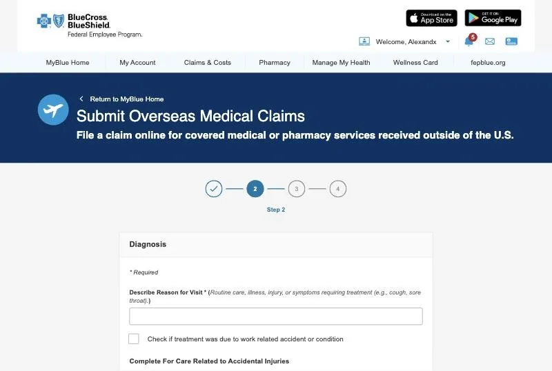 Step 2 in the portal, built on MyBlue design system components.
The self-service program's KPI, moved by a claim form.
And the work kept going: the product owner took the future-iterations backlog to leadership to include in an upcoming PI planning session.
Prefill more from what the plan already knows
File claims for dependent members
Save partially completed claims as drafts
A dashboard to track claims and manage drafts
Native mobile, with the camera for document upload
Expanding benefits without a digital path just moves the work to the call center.
Self-service in a regulated product isn't polish, it's capacity. Ship the MVP, measure the calls, and let the numbers fund the next iteration.