Investigative Journalism Brand & UX/UI Design

Mobile homepage adaptable grid in light and dark modes

animated logo

Editorial images treatment
Reimagining the digital presence of WhoWhatWhy to amplify trust and impact in nonprofit journalism
Overview & Context
WhoWhatWhy is a nonprofit newsroom dedicated to fearless, fact-based investigative journalism. Their mission is to challenge conventional narratives and bring overlooked stories to light. As they scaled their reporting and fundraising efforts, their digital brand and website needed to evolve. Moving beyond a static news presence toward a modern platform that could engage readers, attract donors, and reinforce trust.
The organization approached me to lead the redesign of their brand identity and digital experience. The goal was to create a visual system that conveyed credibility, urgency, and accessibility, while ensuring usability across multiple platforms and content formats.
My Role
Brand Identity Design: Logo exploration, typography, and color system
Design System Creation: Scalable visual language for print, digital, and social assets
UX/UI Design: Redesign of the newsroom’s website and digital experience
Collaboration: Worked closely with editorial leadership and development partners

Old logo
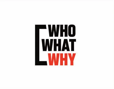
New Logo
The Challenge
The existing brand felt fragmented and inconsistent. Logos varied across platforms, typography was outdated, and the website experience did not reflect the investigative rigor of the journalism.

Early logo explorations
The challenge was twofold:
Unify the brand with a bold, recognizable identity system.
Redesign the digital experience to be intuitive, flexible, and donation-friendly.
Discovery
To understand needs and opportunities, I conducted:
Brand audit — reviewing logos, color palettes, typography, and past campaigns.
Stakeholder interviews — aligning with editors and board members on values and voice.
Competitive analysis — looking at peer nonprofit and investigative outlets.
Key insight: Readers valued clarity and transparency, while donors needed a brand that projected trust and impact.
Definition

Final logo treatment
From the discovery work, I defined brand principles that would guide design decisions:
Clarity: A bold, simple logo that’s legible at any scale.
Urgency: A palette and type system that reflects investigative energy.
Consistency: A flexible system to support campaigns, social media, and digital experiences.
These principles translated into a modular design system that could scale as the newsroom grew.
Ideation
Multiple logo explorations tested different visual metaphors — from brackets (representing framing of the truth) to bold wordmarks (reinforcing clarity and urgency).

Color palette
Typography and color studies explored how to balance serious journalism with modern digital expression.
The iterative process produced a versatile library of logo lockups, icons, and campaign treatments.
Prototyping & Application
Once the core identity was approved, I applied the system across:
Website redesign: Modern layouts optimized for readability and donations.
Campaign collateral: Branded fundraising appeals and social share graphics.
Editorial templates: Consistent type hierarchy and image treatments for articles.
Interactive prototypes allowed stakeholders to preview how the system worked across devices and contexts.
Validation
Through reviews with the editorial team and nonprofit stakeholders, we validated that the new identity:
Reinforced credibility with a strong, consistent logo system.
Improved usability with clearer type, color, and hierarchy.
Supported fundraising with donor-centric landing pages and calls to action.
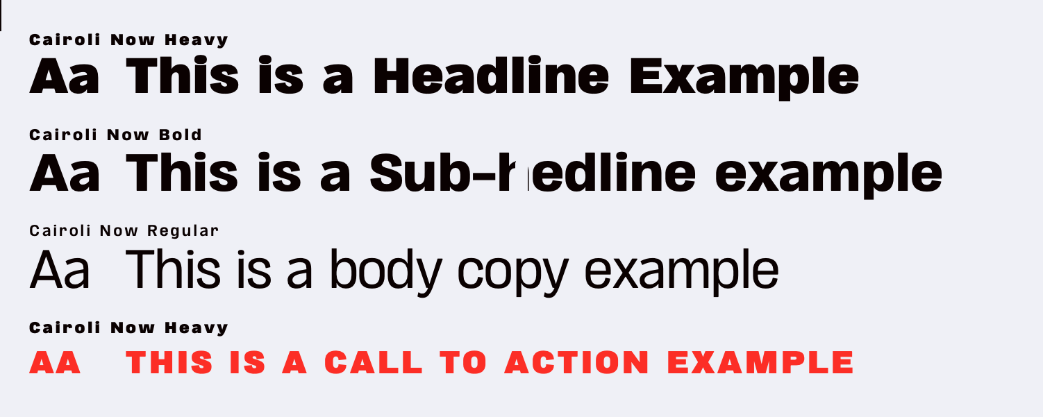
Typography samples
Outcomes
Unified Brand System: A consistent identity across digital, print, and social.
Modern UX/UI: Redesigned website optimized for both journalism and fundraising.
Scalable Design Library: Logo lockups, typography, and color standards for future growth.
Organizational Alignment: Brand guidelines that empowered internal teams and partners.
Reflection & Lessons Learned
Designing for a nonprofit newsroom required balancing editorial integrity with fundraising realities. While journalists prioritized clarity and independence, donors needed impact and trust cues. Bridging those perspectives taught me the importance of building flexible systems that serve multiple stakeholders while staying true to core values.
This project reinforced that good design in journalism is not just aesthetic — it’s a tool for building credibility, sustaining impact, and ensuring vital stories reach the audiences who need them most.
