You lifted the hood.
Here’s the engine.
This site is a design system applied to itself: shared tokens, a small set of components, and pages generated by code from real project files. Same way I’d run it on a product team, at the scale of one.
parallax clamped to ±36px
ambient light: 2 blurred fields, 4% lerp to cursor
prefers-reduced-motion: all off
Started from the live Squarespace site: every case study, the archive and the about page, read and inventoried before anything was redrawn. Then each one rewritten around decisions instead of deliverables.
Built with Claude in Cowork, from Squarespace to this.
Accessible interfaces · Healthcare · Design systems
An Android design system, accessible by default.
An accessibility audit found the app failing WCAG 2.1 AA. We remediated it screen by screen, then turned the fixes into a system.
- Role
- Lead Product Designer, via Optimity Advisors
- Client
- Largest federal health insurance payer, 5M+ members
- Worked with
- Business analysts, product owners, developers
- System
- Android, alongside the web and iOS systems
Overview
An audit showed the member app wasn't compliant with accessibility guidelines. The client set a bar for every digital experience: WCAG 2.1 AA.
The same audit surfaced branding issues and inconsistent patterns, so we fixed both at once with a design system: premade, reusable components so teams stop rebuilding things like date pickers from scratch and drifting apart. We built accessible systems for the desktop member portal and the iOS app. This case is about the third one, Android, and the problems that only showed up there.
An Android app pretending to be iOS.
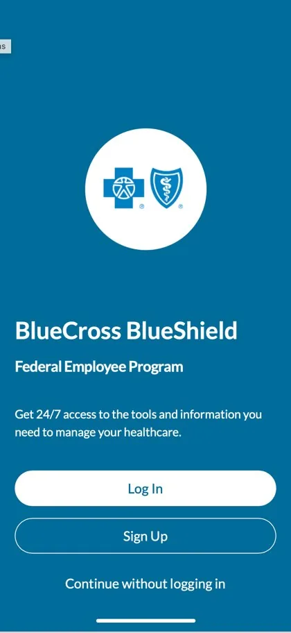
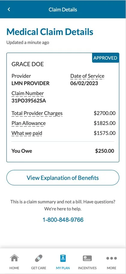
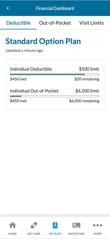
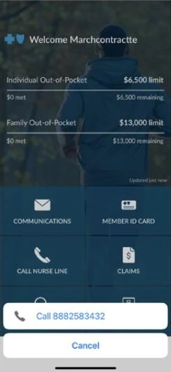
Colors, type styles and animations were used inconsistently, which made the app harder to learn. Key WCAG 2.1 AA requirements, like color-contrast minimums and code annotations, weren't met. And the Android app followed iOS design patterns, which created inconsistencies on the platform and slowed performance.
One system or two?
We weighed one integrated system against two separate ones. Two meant more design work up front. But it let each platform use the maximum number of native UI components, which meant less development work and a faster, more platform-specific app.
Learn Android before redesigning it.
We analyzed and categorized 50+ screens of the existing Android app to find every element that needed to change. In parallel we went deep on Google's Material Design 3 to see which native components the system could lean on, and studied what best-in-class Android apps were doing in Q2 2023, comparing the same products on iOS and Android.
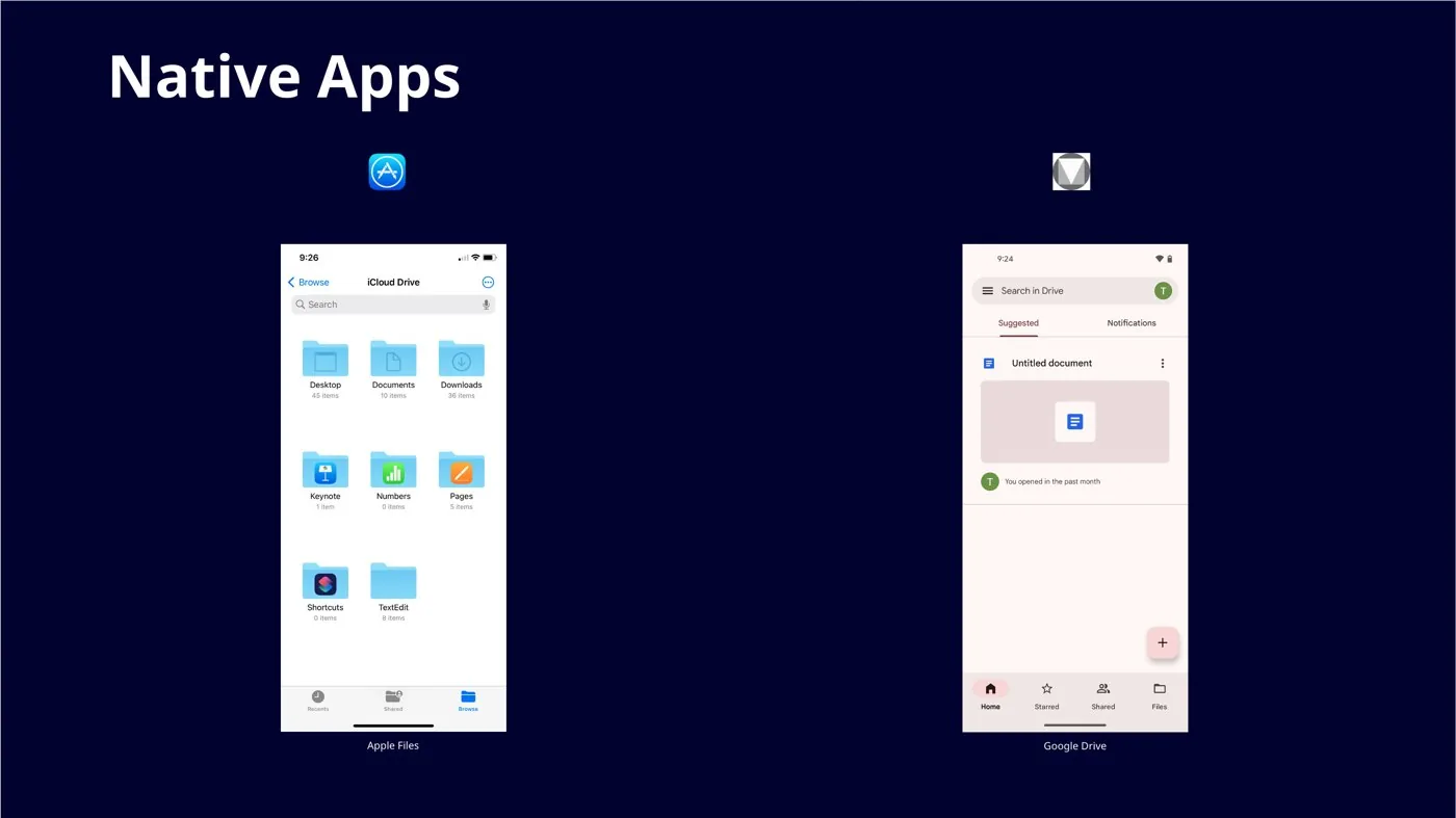 How each platform handles the same job natively.
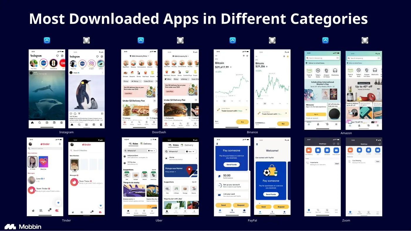 The same eight top apps on iOS and Android, compared pattern by pattern.
Fix it screen by screen, side by side.
Using the Accessibility Management Platform (AMP) report, plus personas and journey maps from earlier work with the client, we built low-fidelity wireframes to settle fonts, text sizes, brand color and contrast. Once approved, we prioritized key screens with the mobile product manager and built them in high fidelity.
Every remediated screen was presented next to the production screen it replaced. That made the improvements obvious to stakeholders and kept approvals moving on a tight timeline.
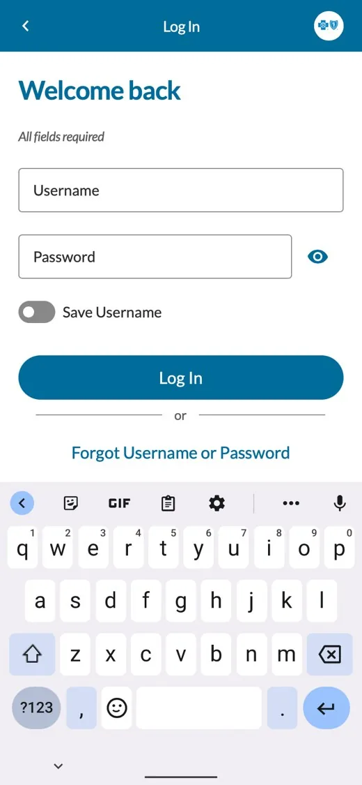
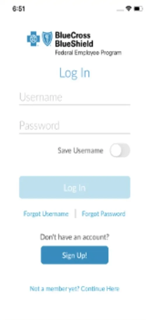
Drag the handle to compare
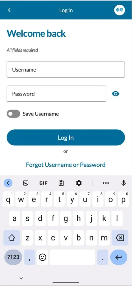
Production used pale, underlined fields and a washed-out button that read as disabled. The remediated screen uses outlined text fields, a visible password toggle, a solid primary button and one combined recovery link.
Ratios sampled from the comparison screenshots, so treat them as approximate. AA asks for 4.5:1 on normal text.
Work backwards, from screens to parts.
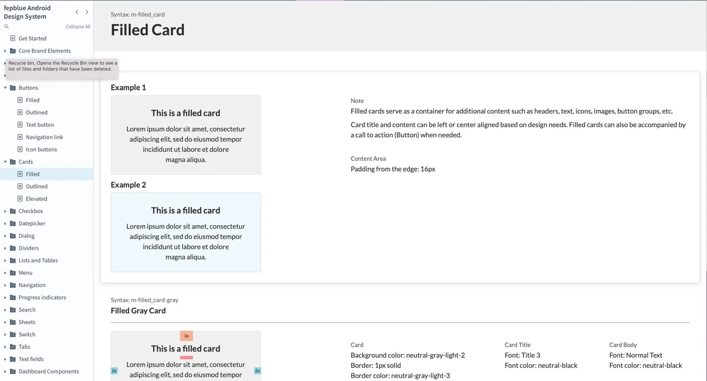
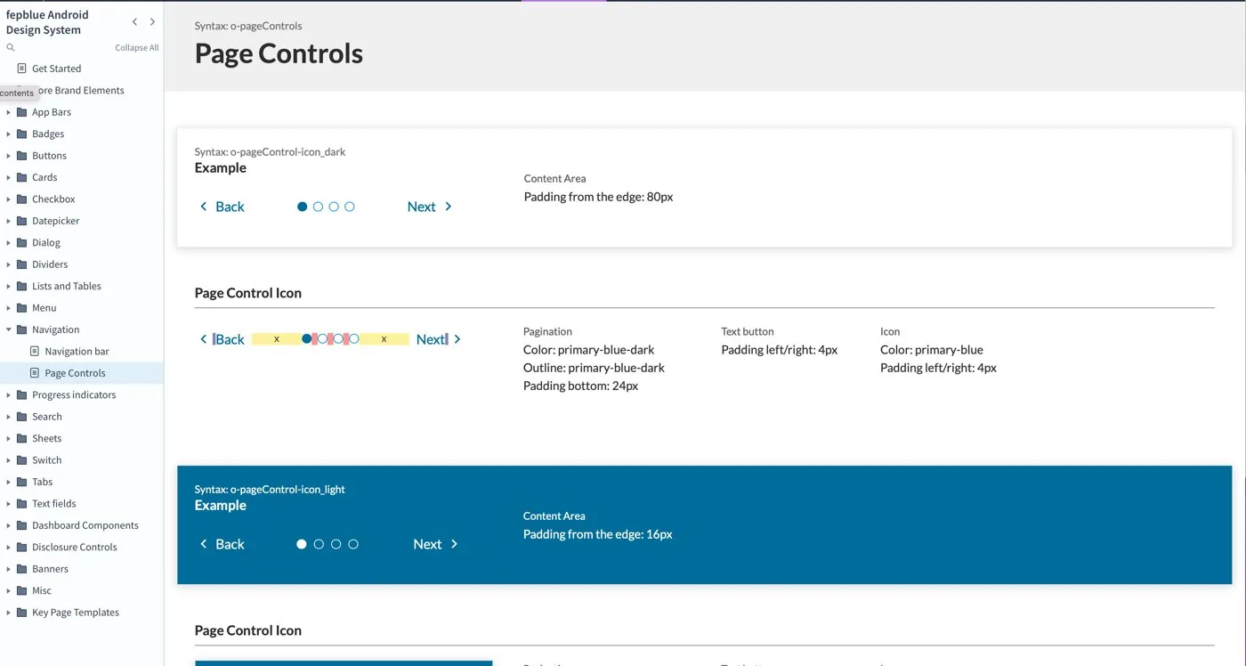
We compiled every approved component and showed how each prototype screen was built from reusable parts, which made adoption easier. The system follows Material Design 3's organization, so stakeholders started from a structure they already knew. Each component has usage guidance and CSS code snippets, and the system is built to grow as features are added.
Components are named by level: a- atoms, m- molecules, o- organisms. WCAG criteria are part of each spec, not a separate checklist.
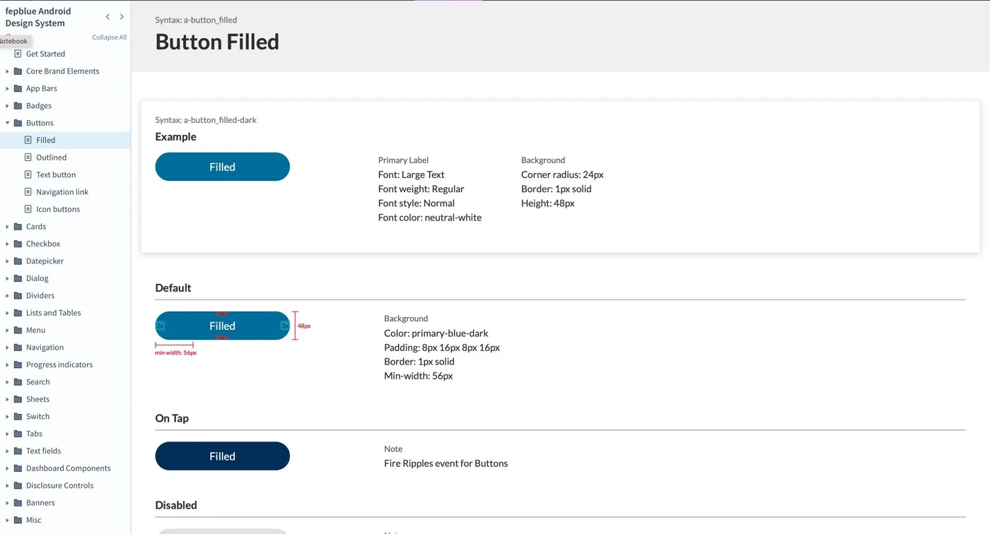
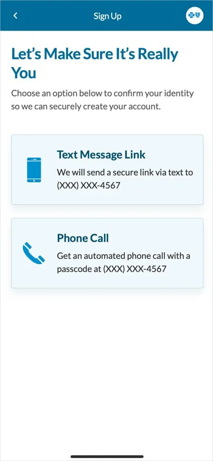
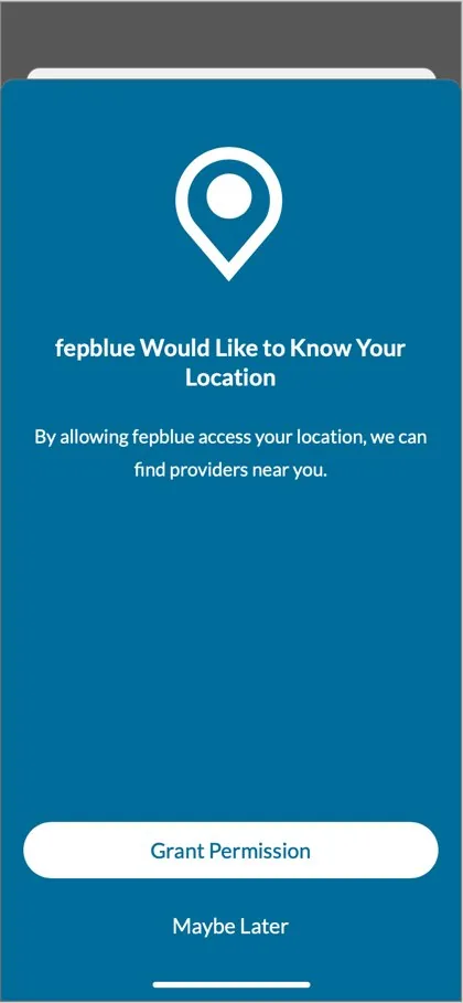
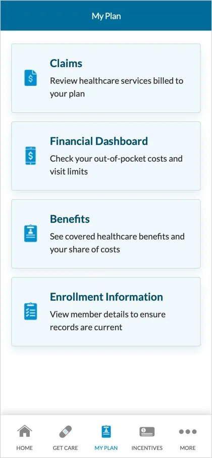
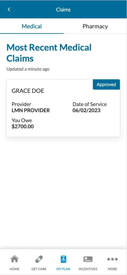
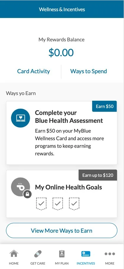
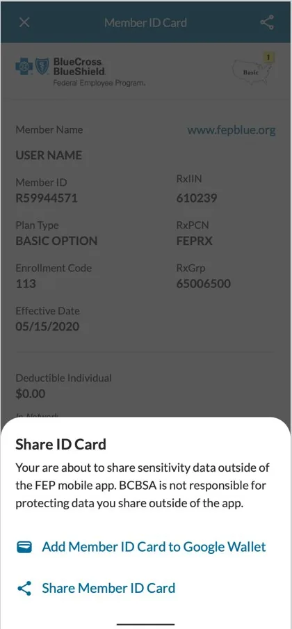
The remediated app
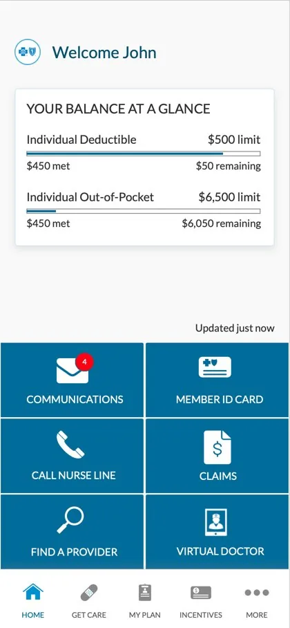
Every screen built from the same components: consistent color, legible type, native Android patterns, and TalkBack-ready structure.
Many stakeholders, conflicting goals.
When conflicts came up, WCAG 2.1 AA and Material Design 3 were the North Star. We also had to make the case for inclusive design to business leaders, and teach technical and non-technical people how, and why, to use the system.
Accessibility isn't only a design job.
UI fixes matter, but a big share of accessibility lives in backend adjustments and settings. It takes designers, developers and everyone else in the delivery chain.
This is step one, not done.
Accessibility is iterative. Regular audits against the latest WCAG standards, plus feedback loops across teams, keep the app accessible as it grows.